Project Overview
Timeline: 3 Weeks
We toured all three Austin locations to understand the clientele and store atmosphere. We also had the unique opportunity to sit down with Hayley, who shared valuable insights about the company’s image, branding, and desired website changes. Additionally, we conducted 7 user interviews to gather feedback on the current website, identifying both positive aspects and pain points. Our findings from these interviews were compiled and analyzed to inform the redesign.
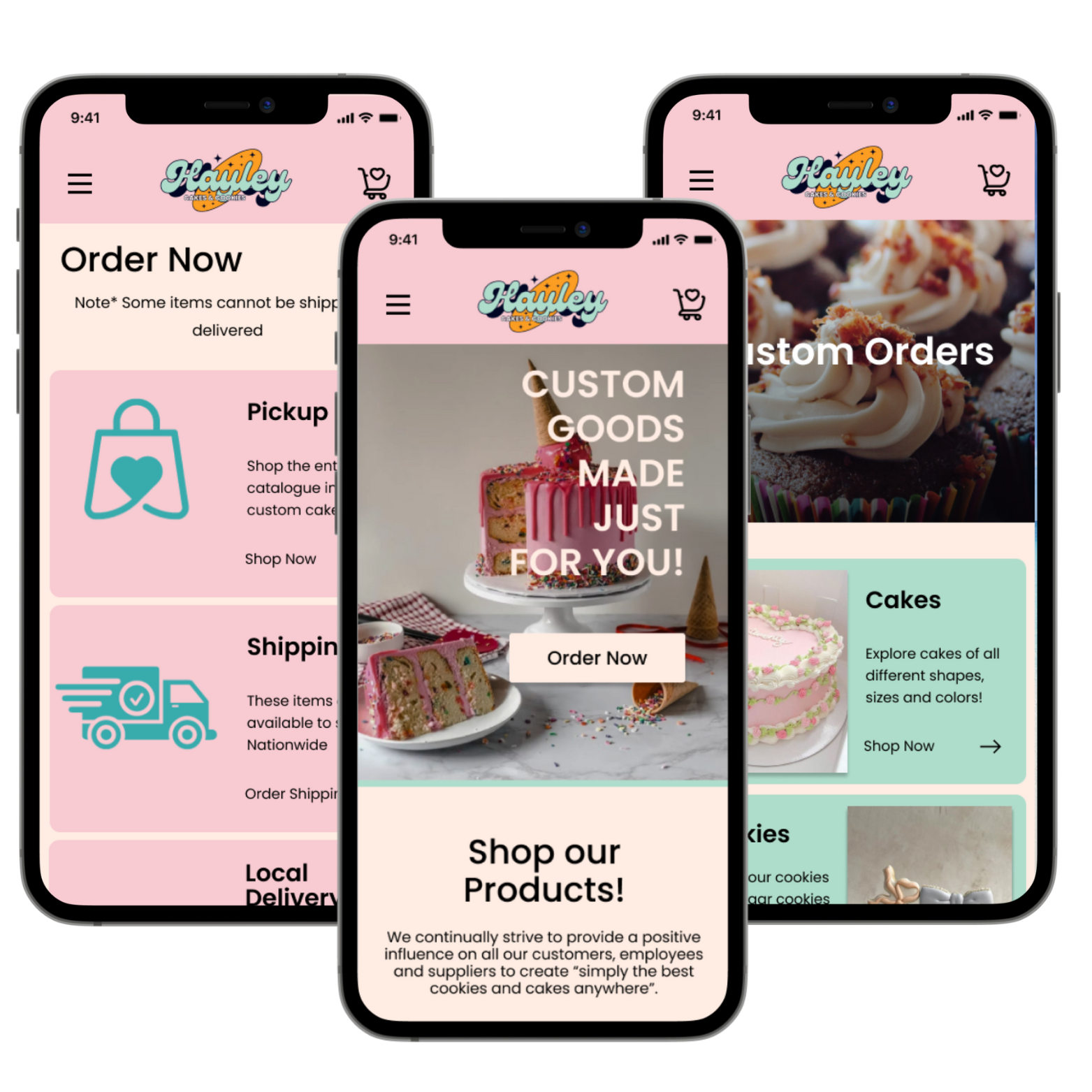
The project aims to redesign Hayley Cakes & Cookies' website to address its outdated design, limited functionality, and SEO issues, which hinder customer attraction and retention. The new design will reflect the brand's playful spirit and improve user experience. Streamlining the homepage and simplifying the shop and ordering processes will make navigation easier. The goal is to enhance user satisfaction and increase engagement through a visually appealing, intuitive, and functional website.
We created a style tile and came up with a color palette and fonts that better represent Hayley and her brand. We also recreated the logo that we also felt fit the brand better.
After reviewing the data from all of our interviews and creating a user persona, we developed a User Journey to showcase what our users experienced utilizing the old website. This helps us understand the user’s emotions and pain points more clearly and gives us a better insight into what needs to be changed.
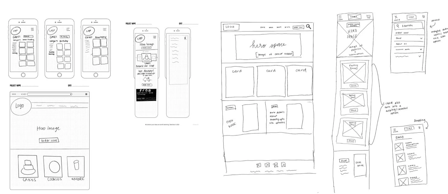
We then sketched out some wireframes to map out what we would like the website to look like. Due to time restraints, we skipped testing the low-fidelity prototype, then went into creating a mid-fidelity/high-fidelity prototype. We tested those on our users and we were pleased to discover our users were satisfied with the changes made to the webpage.
Desktop Prototype
Our Lessons Learned
TIME! As an American author said, “The trouble is you think you have time.” With just three weeks for the redesign, our team learned the importance of time management, facing issues like missed pages and insufficient testing. Usability testing highlighted the need for a dedicated page with location information to aid customer decisions on pick-up and in-store shopping. Skipping the low-fi prototype saved time but led to missed opportunities for better client information and brand promotion, such as a "win a cookie" campaign.


