Project Overview
Timeline: 3 Weeks
Our Proto Persona
To complete their moving tasks before the school year, they need a new Texas license and to update their address and certifications. The DMV website has unclear navigation, with too many buttons and redundant lists, making it confusing. Links are too close together, causing difficulty in finding the correct one. A website redesign is necessary to better guide users to the information they need.
After we made a proto persona we moved onto user interviews to really understand what problems users are facing when using the Texas DMV website.
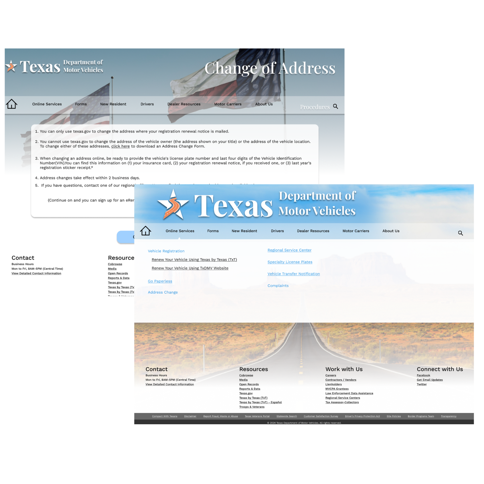
Revolutionizing your Texas DMV experience, our streamlined website offers quick, intuitive access to all your needs as a proud, new Texan. Designed with efficiency in mind, it ensures that managing your Texas DMV tasks is as straightforward and hassle-free as possible, saving you time and letting current and future Texas residents handle everything with ease from the comfort of your home.
Users appreciated the quick link buttons and found the address change process easy to navigate. However, they found the registration of vehicles and address change instructions confusing. There were too many hyperlinks redirecting users off-site to fill out forms, and the overall website design was described as basic and outdated. Most pages were deemed too text-heavy, and the "Other Resources" section for new residents was not helpful.
Same “Texas” Feel
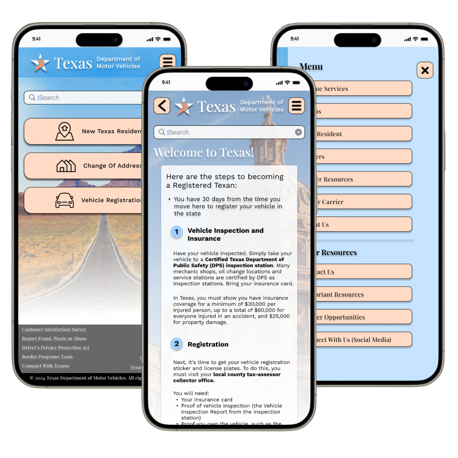
After conducting user interviews and discovering the pain points, we created a mid-fidelity prototype to test. After conducting these tests, we discovered users were having an easier time navigating the site without confusing and unnecessary buttons and links that the old website possessed.
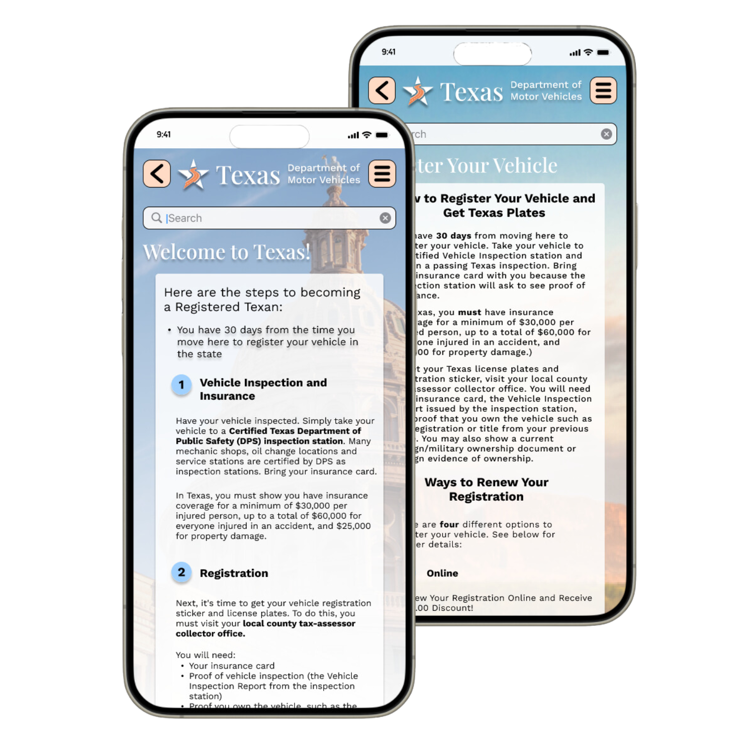
We wanted to continue to deliver that warm welcome feeling to our mobile users by highlighting some of Texas’ beauty, while keeping information in an easy to read and follow format. Using our style guide, we believe we have achieved just that.
Our Lessons Learned
Additional testing brought positive feedback, highlighting streamlined navigation and a welcoming Texas ambiance throughout the pages. Content chunking improved readability and comprehension. However, further testing identified areas for improvement, including adding missing links to navigation, fixing broken pathways on the mobile version, adjusting the colors of overlay screens, and implementing a Home button on secondary screens. These insights will guide enhancements to ensure a more cohesive and user-friendly website experience.


